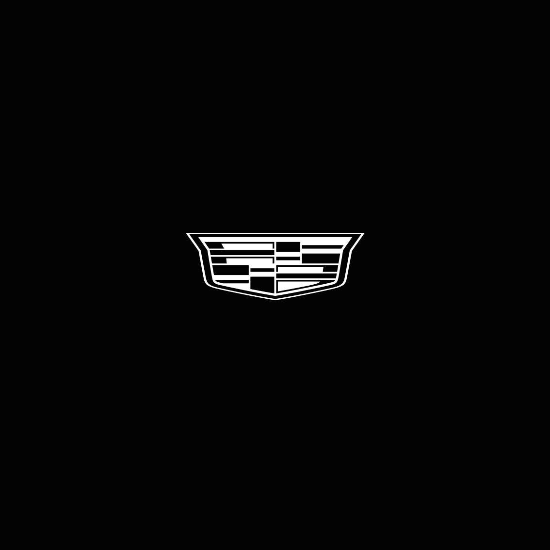
Tag: Matthijs van Leeuwen

Matthijs Matt van Leeuwen Mother Design Andbox Maxwell Osborne Identity

Andbox

Logo and Identity design for Andbox, partnering with Co-creator of Public School Maxwell Osborne.

Designed at Mother Design, NY, with YaYa Xu and George Lavender. 2019.

Matthijs Matt van Leeuwen, Richard Dawkins, Christopher Hitchens, Daniel Dennett, Sam Harris, The Four Horsemen, Maven Publishing, Book Cover Design, Amsterdam, New York

The Four Horsemen

Bookcover-design as part of the Visual Identity for Maven Publishing. New York, Amsterdam, 2019. The dutch published edition of ‘The Four Horsemen: The Conversation That Sparked an Atheist Revolution’ by Richard Dawkins, Christopher Hitchens, Daniel Dennett and Sam Harris.

Het Boek Waarom Judea Pearl Maven Publishing Book Cover Design

Het Boek Waarom

Bookcover-design as part of the Visual Identity for Maven Publishing. New York, Amsterdam, 2019. The dutch edition of ‘The Book of Why: The New Science of Cause and Effect’ by Judea Pearl.

Manifestos Matthijs Matt van Leeuwen Joseph Han Spread The Social Role Of The Graphic Designer Pierre Bernard 2014

Manifestos

A bookproject with Joseph Han. Since the days of radical printer-pamphleteers, design and designers have a long history of fighting for what’s right and working to transform society. The rise of the literary form of the manifesto also parallels the rise of modernity and the spread of letterpress printing. ‘Manifestos’ aims to bring these manifests together in pocket size format. 2014.

Featured on It’s Nice That.

D66 Nightlife Yes!

Poster design for the Dutch Political Party ‘Democrats 66’. A series of political Statements: Nightlife Yes!, Gay Yes!, Study Yes!. 2009.

Acquired by the Stedelijk Museum, Amsterdam, for their extensive Poster/Design Archive.

Het Geheim Van Genot / How Pleasure Works

Het Geheim Van Genot / How Pleasure Works

Bookdesign as part of the Visual Identity for Maven Publishing. Designed at G2K, Amsterdam. 2010 — 2011.

Why is an artistic masterpiece worth millions more than a convincing forgery? Pleasure works in mysterious ways, as Paul Bloom reveals in this investigation of what we desire and why. Drawing on a wealth of surprising studies, Bloom investigates pleasures noble and seamy, lofty and mundane, to reveal that our enjoyment of a given thing is determined not by what we can see and touch but by our beliefs about that thing’s history, origin, and deeper nature.

Vabi brochure cover

Vabi

Campaign design at G2K, Amsterdam. 2010. Vabi software assists architects and engineers on calculations in architectural models and installation technique. ‘Building blocks’, a metaphor for the way the interface of their software functions and actual buildings are constructed was the keyword in design.

EuroCHRIE 2010 Amsterdam

Event-Identity for The European Council on Hotel, Restaurant & Institutional Education, designed at G2K, Amsterdam. 2010. The Hospitality & Tourism educators. Welkom to Amsterdam!

Top Of Mini

Campaign design at G2K, Amsterdam. 2008. Press: ‘BMW-MINI The Netherlands invites young designers to enter a design to be published on a MINI-Cooper roof. The jury is lead by dutch renowned designer Richard Hutten, and Amsterdam based design-office G2K, who are also in charge of the overall-design of the competition.’

We Love Finance

Campaign design at G2K, Amsterdam. 2010. A simple but effective slogan: We Love Finance. Putting the ‘finance professionals’ of Brunel (job recruitment) in the spotlight. A teasing and frank statement in todays financial context. Website, twitter, hugs on location for financial specialists and national newspaper-ads. (various media)

Care Visual Identity

Visual identity at G2K, Amsterdam. 2007/2008. The largest chain of car-repair-shops in Europe. The ‘e’ makes the subtle distinction between car and care.

MW3 Visual Identity

Visual identity at G2K, Amsterdam. 2009. MW3 founded by a ‘wealthy’ collective of men, aims for providing a safe webinterface, when one deals business outside the office. The tickertape which covers all the stationary, repeats MW3.

Zwind Visual Identity

Visual identity at G2K, Amsterdam. 2008/2009. In collaboration with Laura Hirt. Zwind operates in the public arena; creating local projects for social issues.

Matthijs Matt van Leeuwen, Joep Moonen, G2K Designers, Amsterdam, Identity, Logo

Joep

Visual Identity at G2K, Amsterdam, for Joep Moonen, a small real-estate dealer. ‘It’s… JOEP!’. 2008.