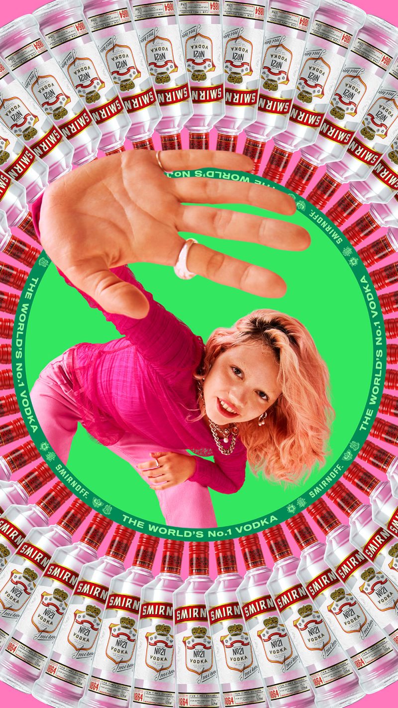
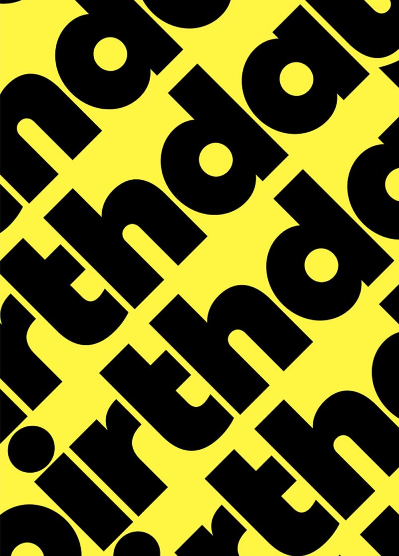
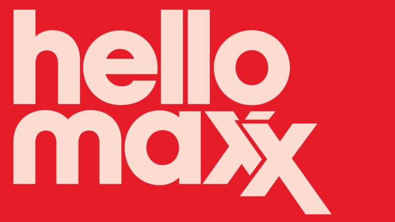
| Bonjour! | BRUNEL ANNUAL REPORT 2008 | URBAN | ZWIND | SMILE | MW3 | IJSSELDELTA a-Z |
PLASTICITY | TOP OF MINI | GLOW | AMSTERDAM CREATIVE CROSSINGS RESEARCH | IJSSELDELTA | AMSTERDAM CREATIVE CROSSINGS | HOUTHAVEN |
RECRUITMENT CAMPAIGN 2007/2008 JAN VAN EYCK ACADEMIE | JOEP | CITYGRAPHY | LOGO PARC | PROGRAM BROCHURE 2007 JAN VAN EYCK ACADEMIE |
CARE | PLAYING THE URBAN | THINKING THROUGH THE BODY |
POSTSTAMPS | YEARBOOK ACADEMY OF ARCHITECTURE ARNHEM 2000/2001 | BLOMJOUSARCHITECTEN.NL | CITYJAM | HOUSE OF ORANGE IN DUTCH EDUCATION | SLO | DANTHE | DE KUNSTEN | OBSERVATORIUM.ORG | HET MING PRINCIPE (THE MING PRINCIPLE) |
STAD IN DE WOLKEN (CITY IN THE CLOUDS) |
11 SEPTEMBER EN DE KUNSTEN (SEPTEMBER 11 AND THE ARTS) |
OOSTERHOUT-ARCHITECTEN.NL | TYPOGRAFIE/BEELD IS CULTUUR (TYPOGRAPHY/IMAGE IS CULTURE) | INBURGERINGSGIDS (NATURALISATIONGUIDE) | HkA | GONZOCIRCUS | HET GAAT GOED MET TESS EN MALOU (TESS AND MALOU ARE DOING FINE) |
PLEIN-PUBLIEK.NL | VERHALEN VAN VETERANEN (STORIES OF VETERANS) |
GRADUATION | STATS & GRAPHS | SOFASALON |
This site gives you an overview of my work. Many projects are made in collaboration. The website does not function as a complete archive(!) but acts as a personal overview. Please enable pop-ups! |
2009. Annual Report@G2K. (offset: 3 x PMS) Brunel Annual Report 2008: Enhanced Stats and Financial Records provide the background in design in this Annual Report. |
2007/2009. Research. Urban graffiti meets Theory on Urbanity and Public Space. First version created during Logo Parc, finished in 2009. The anonymous tags and graffiti are replaced by the names of philosophers, politicians and architects reflecting on Urbanity and Public Space, who in themselves become anonymous and encrypted again. As a contrast to street vs. theory. Alain Badiou, Chantal Mouffe, Bernard Tschumi, André le Nôtre, Francois Mitterrand etc. |
2008/2009. Visual Identity@G2K. (various media; offset: FC) Zwind operates in the public arena; realising local projects for social issues. First results; Identity still under construction, including website. zwind.nl |
2009. Smile |
2008/2009. Visual Identity@G2K. (offset: 3 x PMS + Black) (Website under construction) |
2008. Research@G2k. The underlying graphical alphabet, used for the visual identity of the IJsseldelta. 2 times 26 letters makes 52 pages. |
2009. Research. Detached from habitat and uncovered of their smiling messages, these ‘plastiques’ transform into a anonymous collection of shapes and mass withholding their original purpose; what's left is a almost ‘typographic’ series of seemingly well-familiar objects. Positive/Diapositive |
2008. Visual Identity@G2K. (various media) Press: ‘BMW-MINI The Netherlands invites young designers to enter a design to be published on a MINI-Cooper roof. The jury is lead by dutch renowned designer Richard Hutten, and Amsterdam based design-office G2K, who are also in charge of the overall-design of the competition.’ topofmini.nl projecttopofmini.nl |
2008. Visual Identity@G2K for GLOW-SC. (silkscreen+offset) The identity unveils it’s true-colors at night, when the glow-in-the-dark-ink lightens up. |
2008. Research@G2k. Small visual-research-document on the identity for Amsterdam Creative Crossings: A spiderweb-esque structure in which the ‘logo’ isn’t fixed, but acts as a dynamic interface; symbolizing the intention of ACC: establishing (side)connections between business and culture. |
2008. Visual Identity@G2K for IJSSELDELTA. (various media) ‘On Tuesday June 24th, 2008, The IJsseldelta region in The Netherlands waved its flag, showing the new identity created by G2K. The visual style was inspired by the nautical alphabet and the coats of arms of the cities in the area, a rich and fitting source.’ |
2008. First steps Visual Identity@G2K for AMSTERDAM CREATIVE CROSSINGS. (various media) |
![]()
2008. Brochure+first steps visual Identity@G2K for ‘Houthaven’, an Amsterdam area under construction; living & working. (offset) ‘Land in sight!’ The identity is based on the very visual metaphor of looking through binoculars towards undiscovered land. With an added fluor-yellow in print. |
|
2008. Visual Identity@G2K for Joep Moonen, a small real-estate dealer. (offset) ‘It’s... JOEP!’ |
2006. Posterdesign@Jan van Eyck. 2006. Recruitment and invitation. |
2006/2007. Logo Parc. Research on Public Space. Advised by graphic designer Daniel van der Velden at the Jan van Eyck Academy. Fellow researchers: Katja Gretzinger, Gon Zifroni and Matteo Poli. |
2006/2007. Bookdesign@Jan van Eyck. (offset) |
2007/2008. Corporate Identity@G2K for Care. (various media) The largest chain of car-repair-shops in Europe. The ‘e’ makes the subtle distinction between car and care. |
2007. Posterdesign. Poster & program-brochure in one. Folded from A3 > A4. (offset) |
2006. Posterdesign@Jan van Eyck. Invitation & program-brochure. Folded from A4 > A2. (offset) |
2000. Poststamps, in which the style of the Dutch stamps of Peter Struijcken is used to tell a new story. The portrait of Queen Beatrix is replaced by those of several dubious worldleaders. Rebel-leader of the Kurdish Abdullah Öcalan, President Mobutu of Zaïre, Yassar Arafat leader of the Palestinians and Ayatollah Khomeini, spiritual leader of Iran. |
2002. Magazine/Catalogue. (offset) The content of the catalogue, the student-projects, are placed in a broader cultural frame, which contextualise the projects. |
2004. Websitedesign for Blomjous Architecten bna. |
2004. Corporate identity for ‘CityJam’, a project by Hooghuis, Arnhem. (offset in fluor PMS) The identity is formed by a collection of images brought together on an associative base. Some are directly related, others with the blink of an eye ;-). The A2-poster can be printed directly, but is also designed with the possibility to be cut up in four pieces. Each piece (A4) tells a part of the bigger story. These pages can be used as stationary. Maximum effect is created by the use of fluor colours. |
2005. Brochure and Publication. (offset) |
![]() 2004-2006. Corporate Identity-Design within an existing framework for SLO. (offset) |
2004-2006. Corporate Identity-Design for Danthe (support, counseling, training and advise for works councils). In collaboration with Gerco Hiddink. Graphic contours from actual ‘situations’ in the Danthe-trainings are used for the identity. Website+print (3 fluor-colours). danthe.nl |
2001. Indexnumber ‘Tien Jaar de Kunsten’, magazine of the HkA. In collaboration with Floor van Essen. (offset) Main idea behind the design for De Kunsten issue is an giant index-list. The index is put together out of names of employees, writers etc., who worked on the magazine in the past decade. We used the index as a list of honour. The issue starts with the index which covers the first pages. It almost resembles a phonebook. |
2001. Commissioned by Felix Janssens and the Observatorium. (Foundation for the arts. Developing Art projects in relation to urban planning and landscape.) Proposal for a new website. In collaboration with Maarten Verweij. Main function of the website is that of archive. The design moves around a ‘simple’ but effective 3x3 grid in which all information can be obtained. Important aspect is that the ‘photographed’ archive at the same time functions as site-navigation. Certain objects like filmrol, script, photo and scrapbook function as main theme headers. Searching in this way for information acts like a ‘unguided missile’; no idea where you'll end up. Unexpected confrontations. |
2004. Muzieklab Brabant. In collaboration with Gerco Hiddink. (offset) Poster of a series of public concerts performed by an ensemble of Dutch and Chinese musicians. After diverse rejected proposals we decided to make a gesture by making a ‘wallpaper’. The flags are used as a logo / trademark which is repeated indefinetely which makes a kind of ‘dessin.’ |
2004. Poster and website (www.stadindewolken.nl). In collaboration with Gerco Hiddink. (diverse media) Stad in de Wolken is a series of debates by the stage LUX in Nijmegen. In this debate high-rise building is discussed in the region Arnhem-Nijmegen. (KAN-Area). |
2004. Visual Identity for a six-day debate on the influences of 9/11 on art and design. (diverse media) Underneath the information-layer lies a ‘live’ CNN-NEWS-stream from during the disaster. Within the website this layer is animated. Typography is set in IBM Orator, a classic matrix typeface. In collaboration with Gerco Hiddink. |
2004. Architectural office website. In collaboration with Gerco Hiddink. It’s all about pop-ups! |
![]() 2002. Term paper Graduation. The visual term paper functioned as upbeat for my graduation. Executed on actual newspaper size (A2). The term paper researches cultural/typographical qualities in newspaper design. The newspaper as cultural phenomenon and blueprint of a culture. |
|
2002. Advertisments HkA. |
![]()
2003. Proposal for a new design. (Not executed.) In collaboration with Gerco Hiddink. GonzoCircus is a bi-monthly magazine dedicated to experimental and alternative music. The magazine-design is placed upon a layer of recent and actual articles, directly copied from other music-magazines. This layer interacts directly or indirectly with the specific article. The music is placed into a broader perspective. |
2004. Bookdesign. In collaboration with Gerco Hiddink. (offset) Review of a project at a high school in Enschede. Main ingredient are the stories, opinions and experiences, shared by several people (teachers, students, assistents, head of the school). For the cover we used clusters of festive confetti which are filled with pictures of the main characters in the book. |
8.2002-8.2006. Website of the office Plein Publiek, established in 2002 by me and Gerco Hiddink. Weblog. gercohiddink.nl |
2005. Bookdesign. (offset) A publication about veterans (the young and the elderly) in public education. Veteran-stories are told in school. The cover is designed as a ‘collage’ in which recent and past pictures of war veterans, on the battlefield and in the classroom are put together. This collage is copied to a poster which is folded around the publication. In collaboration with Gerco Hiddink. |
2002. Hogeschool voor de Kunsten Arnhem. Part of my graduation in which any possible doubt about ‘The Netherlands as a Multicultural Society’ is dispelled. On different levels symbols are exchanged and appropriated. The entrance of the Lower House is covered with stickers as a metaphor in which appropriation and integration are expressed. A publication on exchange and appropriation of cultural characteristics accompanies the images. It describes the exchange on a local and global scale. Streetpictures, magazines, stickers and ‘objets trouvés’ express the feeling of a multicultural world. Architecture which visually links to Arabic Mathematical Patterns, Chinese filmposters who copy western depiction of moviestars or a Japanese character (Hello Kitty) which resembles our Nijntje. |
2000. Research. A personal research on expressive qualities of statistics and graphs. Main target of this study is a personal search for alternative ways to represent ‘hardcore graphs data’. The graph in this plan is represented by a series of personal collection objects. |
![]()
2004. Poster Merleyn, cultural stage, Nijmegen. In collaboration with Gerco Hiddink. Poster on the top: As one of a series, the poster puts the program of Merleyns ‘SofaSalon’ in a broader cultural/actual frame, in which diverse opinions and arguments are displayed; ‘comic-style’. |